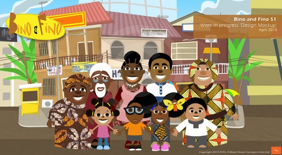
Bino and Fino's New Look
 Click for a larger version of the picture
Hi all. Here is an image of the general design direction of the new Bino and Fino episodes. There is still more work to be done regarding locking down the look and getting it to a particular standard. We’ve experimented with different visual styles but have decided to build on and refine the style that existed had in the 1st episodes. One thing is for sure, there will be NO quality drop in terms of visuals between the new episodes and any comparable children’s educational series out there. I am very keen to give the show its own personality for the kids and adults alike to relate to. The visual style plays a big part in that. Let us know what you think so far.
You might also like to read:
Why There Are So Few Nigerian Kids TV Shows

